
1/11/2025
Today the group met together to complete the presentation and work on fx tests to input in the storyboard. During this time, I collected shaders and models I can use as inspiration for the look development. While Wren and FX teammates were working on their respective assignments, I created some simple animation tests to replace the storyboard sections for a better understanding of what we plan to do for the shot.
Unfortunately, Gracie will be unable to attend the Tuesday presentation due to XR filming for her senior project, as the four of use divided the presentation to help cover Gracie's spots. Professor Fowler and Gaynor showed an presentation dissection from Claude. The AI dissects the presentation and lets the responder know the strengths and weaknesses, and how to improve sections in the slides. Claude gave Valuable input which we plan to incorporate into our presentation before the submission.
1/9/2026 - 1/10/2026
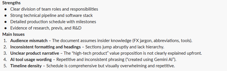
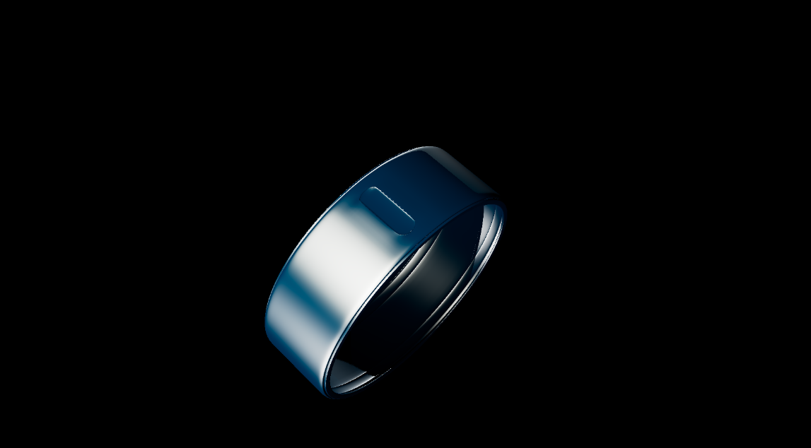
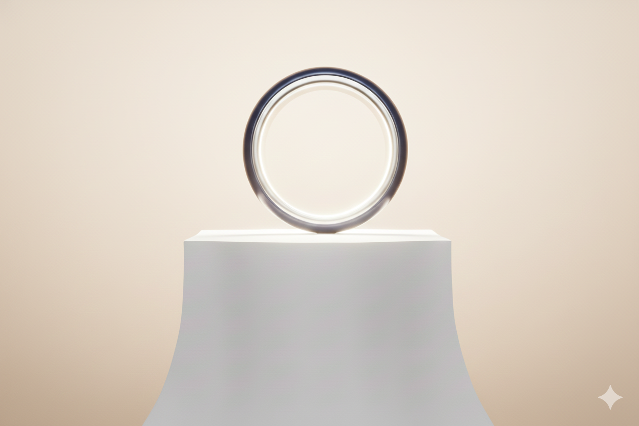
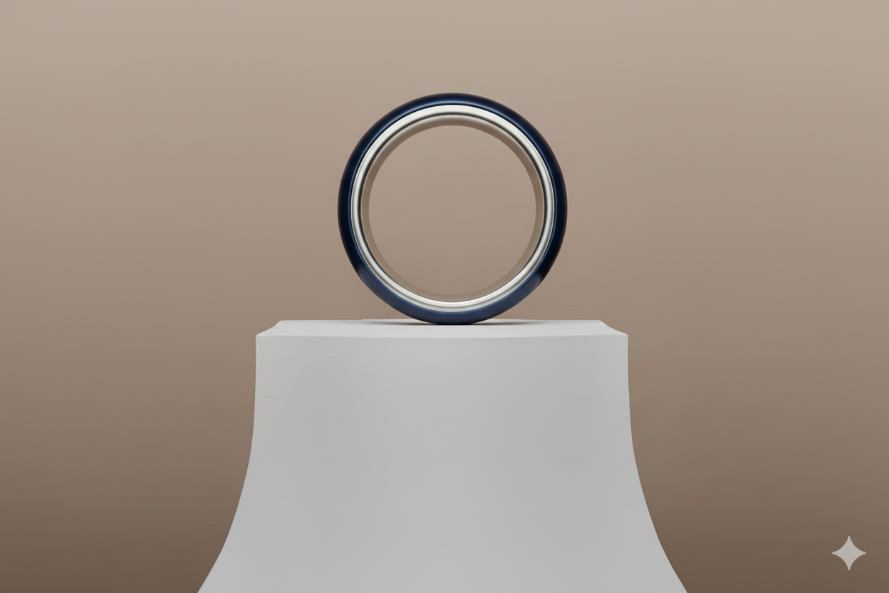
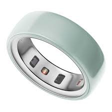
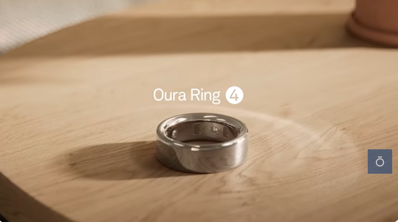
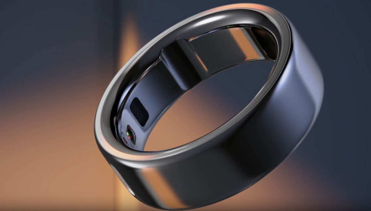
Over the next two days, I focused on developing visual concepts for the ring itself while also gathering reference to ensure it would feel believable and grounded as a real, high-end product. Since the ring is the visual anchor of the entire ad, a lot of attention went into studying real-world product photography and existing Oura Ring marketing to understand how the material responds to light.
I looked closely at surface qualities such as ceramic softness, edge highlights, and subtle imperfections that help prevent the ring from feeling overly CG. Reference images were especially useful for understanding how light wraps around the curved form, how reflections behave at different angles, and how the interior of the ring reads when lit. These observations will directly inform both the look development and lighting decisions moving forward, particularly in how the ring is introduced and emphasized in hero moments.
AI-Assisted Previsualization
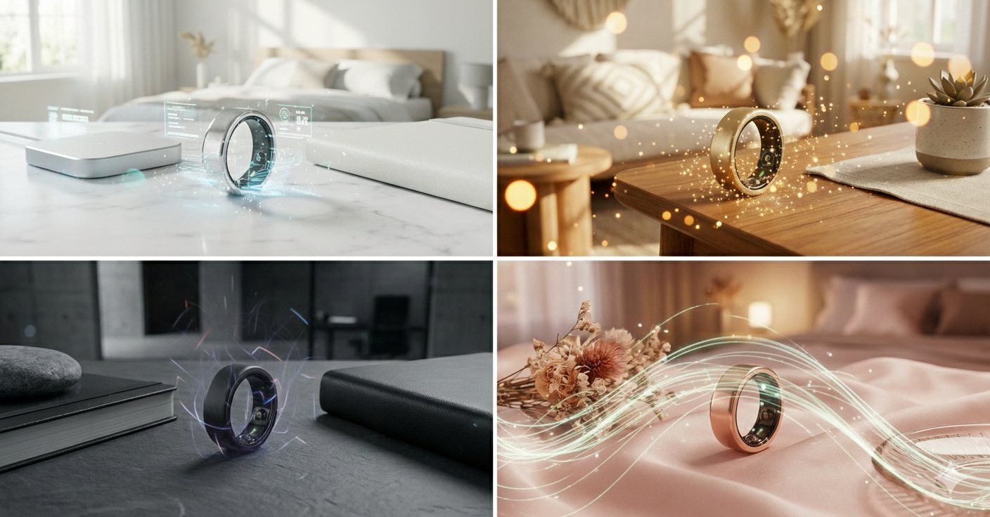
In parallel with this research, I used Google Gemini as part of the ideation and previsualization process. I prompted Gemini to generate rendered interpretations of the ring placed within environments similar to our planned shots. These images weren’t intended to be final references, but rather a way to quickly explore lighting direction, color contrast, and overall mood before committing to a full 3D setup.
Using Gemini in this way helped accelerate early decision-making. It allowed me to test how different ring finishes might read against natural environments, how warm versus cool lighting could support the temperature-tracking concept, and how the ring might visually separate from the background in motion. These AI-generated previs images served as a helpful bridge between rough storyboards and more detailed lighting and look development work, giving me a clearer starting point for building the shot in 3D.
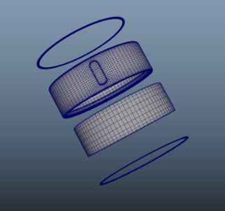
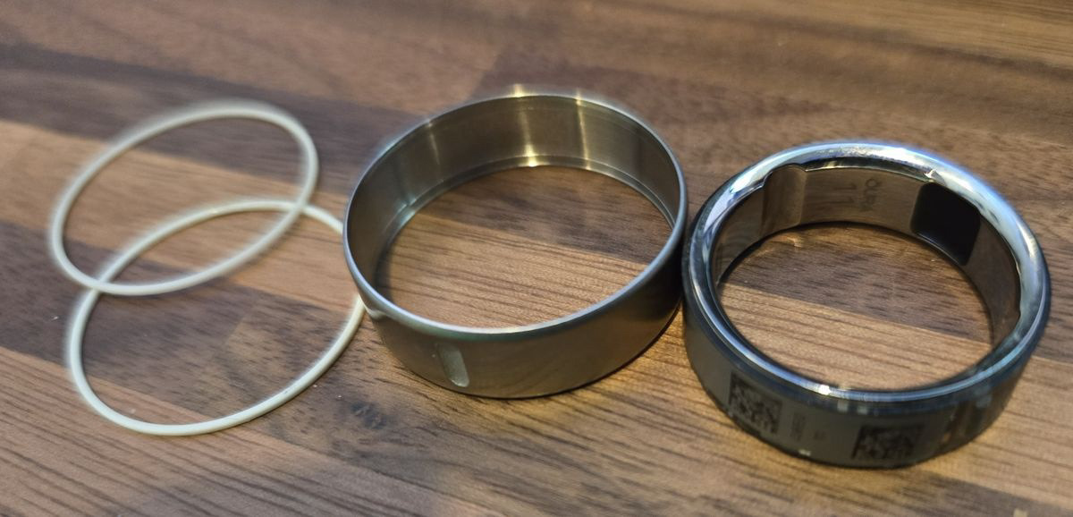
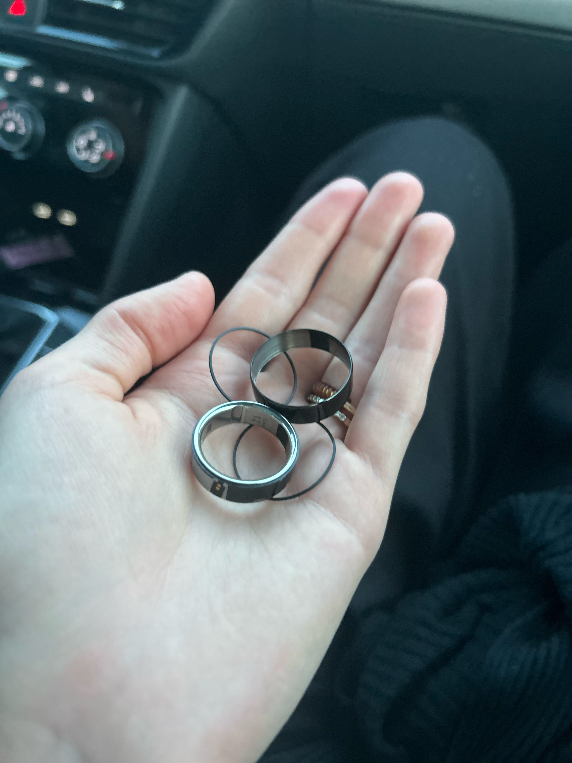
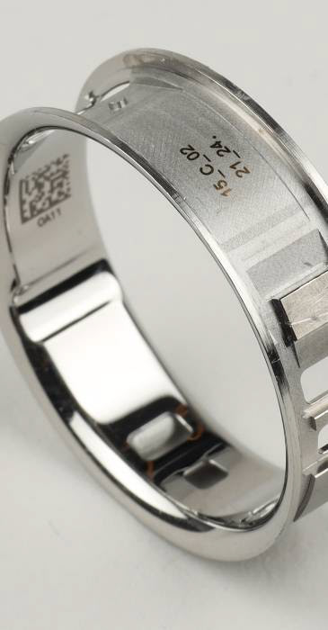
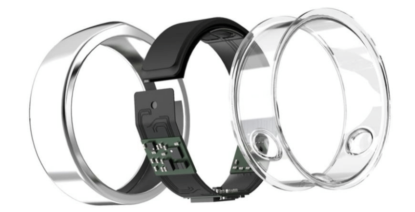
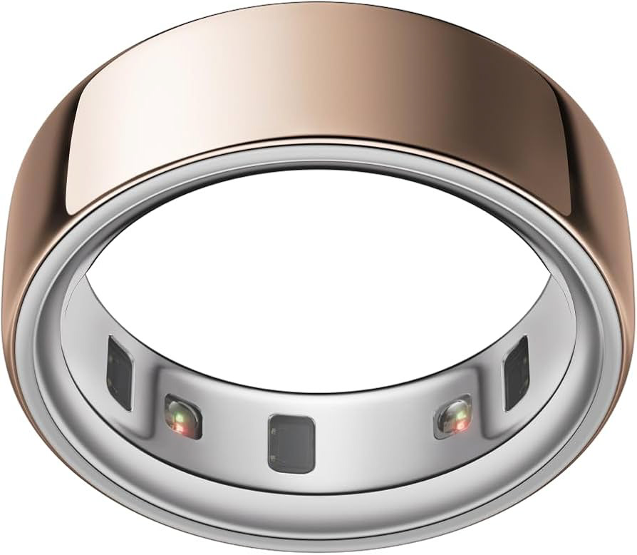
Using References, I have started working on my Ring model since it is essential for the FX Teammates to have it early on. I only have the inner metal portion to examine and model to exact realism, so it can pass as realistic.
While in the process of Modeling, the references listed did not have clear angles of the oval design engraved into the outer ring, so some time examining became a factor as well.
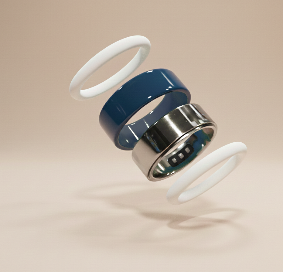
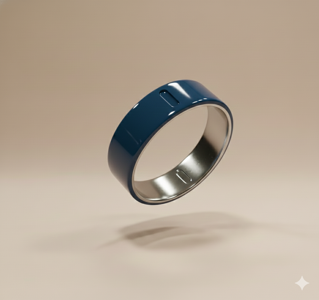
Using Google Gemini, I created multiple renders for Shots 1 and 5, using the Maya model as a base, which can render for lighting and look dev. Using the Past color backgrounds they used, I was able to make the establishing shots represent old advertisements. In my AI Section, where I post the prompts and images, you can establish that the more imaginative the prompt, the more wacky the image can become. the hardest image to make was the sectioned ring separating, since there are no images of it out in this direction laid out. Because of this, I had to use my ring as a base and it "rendered" over that screenshot. I will be using these concepts for possible lighting inspiration.
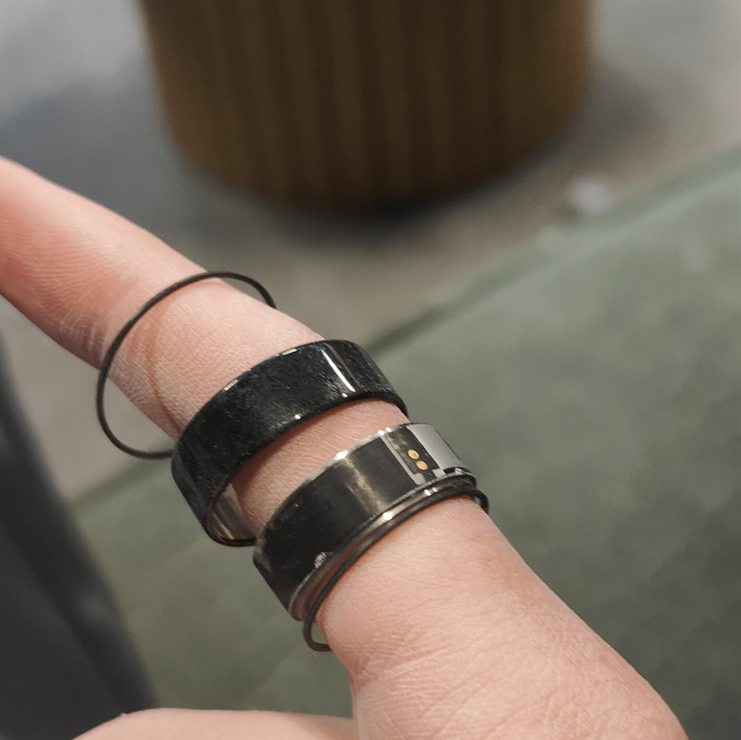
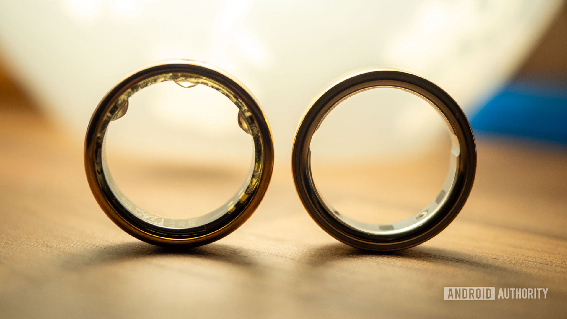
While looking for references, I was having a difficult time finding
accurate references of the ring broken down into sections. Because of this hardship, I spent quite a while finding good quality versions of the ring for reference, since the ring version is new.
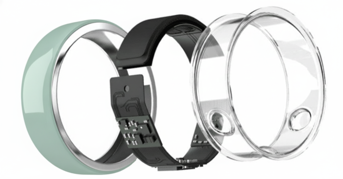
During this process, I discovered the ring can be broken down into four main sections: Silicone rings on the sides, the Outer portion that is either Ceramic or metal, and the Inner metal portion that contains the scanning mechanism.
Because of the New version of the ring we will be using, I could not find an up-to-date compartment blueprint of the scanners. Because of this, the team decided to stick with four main compartments, but if there is a push to creatively model the scanners for the breakdown, it will be worked on.
1/8/2026
Today the group met to share the individual storyboards we had each developed and to align on a final direction for the advertisement, as well as get formal greetings from the mentors. Reviewing everyone’s ideas together helped clarify the overall structure, and through continued discussion we narrowed the piece down to five core shots that will make up the final ad:
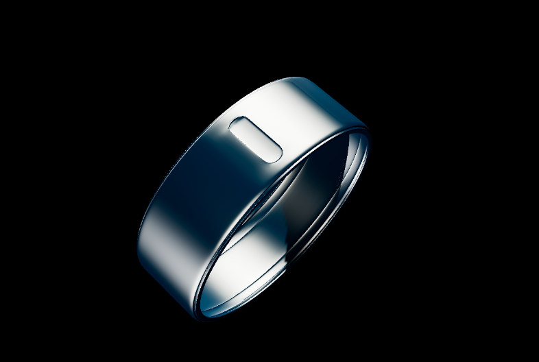
Shot 1: The ring is introduced resting on a pedestal before falling off and beginning to move on its own.
Shot 2: A stylized visualization of the ring’s heartbeat monitoring feature.
Shot 3: A floral sequence used to represent temperature and cycle tracking.
Shot 4: Fabric-based imagery to communicate sleep tracking.
Shot 5: A final hero shot where the ring hovers midair before resolving into the logo.
Each shot will feature a different ring color, with custom transitions to smoothly shift between them. The ring itself will act as a continuous visual element, moving independently through each shot and exiting the frame to lead into the next.
Once the shot list was finalized, We discussed which Fx artist would work on the shots, resulting in Max working on heartbeat tracking, Gracie working on Temperature and Nature tracking, and Cae working on cloth physics to represent Sleep tracking.
Establishing and Ending Shot Ideation
The storyboards helped solidify how the ring moves through the environment and how each moment transitions into the next. Rather than treating each shot as a static product pose, the boards emphasize continuous motion, with the ring acting as a guiding element through the scene. This approach reinforces the idea that the ring is active and responsive, rather than passive technology.
Early panels focus on introducing the ring in a clean, centered composition, allowing the audience to clearly read its form and material. From there, the movement becomes more fluid and organic as the ring travels across surfaces and through the environment. The terrain begins to feel more natural and uneven, which supports the transition into the floral setting and the idea of environmental response driven by temperature.
Several storyboard frames explore how the ring interacts with its surroundings—sliding, hovering, or falling—creating moments where lighting can shift to emphasize cause and effect. As the ring passes through the scene, the environment reacts: frost melts, forms soften, and flowers begin to bloom. These moments are intentionally paced to allow lighting changes, such as warming highlights or internal glow, to visually communicate the temperature and cycle-tracking concept without relying on explicit graphics.
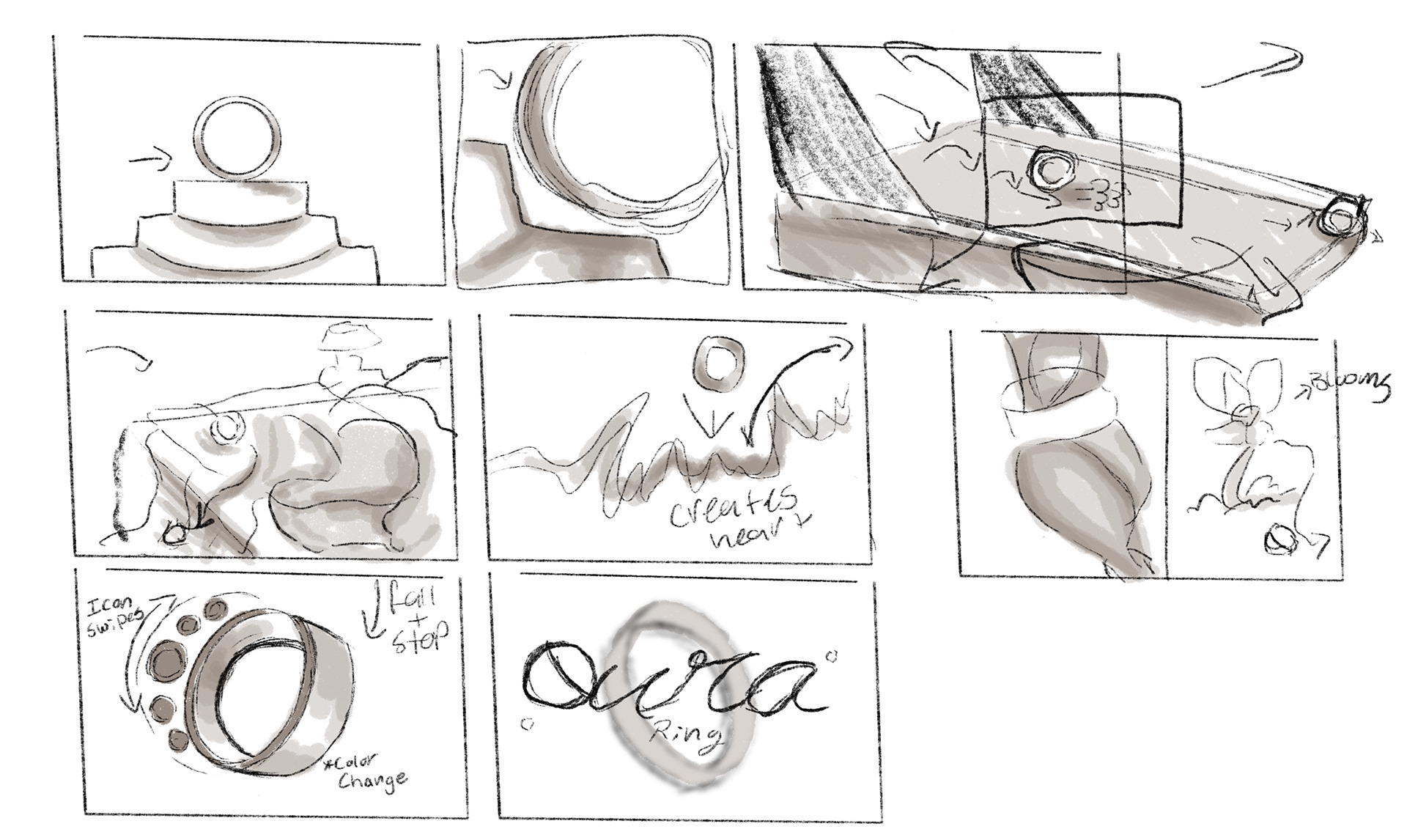
The final storyboard panels focus on clarity and branding. The ring is isolated again, giving it space to read cleanly before transitioning out of the shot. Notes about color changes and ring rotation are included to remind the viewer that material response and surface detail will play a major role in selling realism.
Visual Development & References
To support this direction, I gathered a range of visual references from The Oura website to guide the look and mood of the Shots. I also used Google Gemini during the ideation phase to generate concept imagery of how the ring could appear within this advertisement cohesively.
Using these references, I created a complete set of storyboards for Shot 1+5, along with a reference sheet to help plan composition, Lighting Mood, and transitions. I also spent time collecting video references from YouTube and Websites to study real-world Breakdown for the ring and how to model the ring realistically into parts for the end shot.
Overall, this process helped solidify both the visual direction and the technical approach for the shot, and I'm very excited to start working on the model process and lighting look development.
1/7/2026
Our group met again today to continue developing the concept and narrow down a clearer direction for the project. During this discussion, Wren proposed an approach that helped solidify the idea: using each ring color to represent a different function of the product. This gave the concept a stronger structure and helped connect the visual design more directly to the technology behind the ring.
From there, we identified four core features to focus on:
* Sleep tracking
* Heartbeat monitoring
* Temperature and cycle tracking
* Activity tracking
* Heartbeat monitoring
* Temperature and cycle tracking
* Activity tracking
Each of these functions sparked a range of visual ideas, both for individual shots and for how the advertisement could flow as a whole. From a lighting and look development standpoint, this opened up opportunities to explore distinct moods and atmospheres for each feature while still maintaining a cohesive visual style across the piece.
By the end of the group meeting, we had generated more ideas than could realistically fit into a single ad. To manage this, each group member will be developing their own take on the overall concept and shot ideas. We plan to bring these together in our next meeting and combine the strongest elements into a finalized shot list.
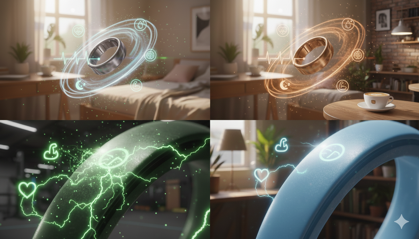
During this process, I used Gemini to create possible scenes we could use for the Ring advertisement. I started off with just generating different environments to suit each ceramic color to show different aesthetics. Also, did a different version that shows more "tech" focused graphics. In my AI Section in my blog, I show the prompts I used to create the images.
Some basic reference images I was able to find to start the storyboarding process. Being able to use the simple ring images, I can import them into AI to make some rendered ideation concepts.
During finding references, I was also figuring out the aesthetic that Oura implements into their branding, as well as Wren sending their branding document. Because of the document, the storyboards could be made to better represent the company and their color pallette.


1/6/2026
The first day of the SCAD x New York collaboration class focused on outlining the structure of the quarter and introducing the expectations for cross-campus teamwork. After going over the general guidelines and a prompt overview, the professors assigned us to project groups. The team includes Max Jokinen, Gracie Szymanski , Wren Pellant, and Cae Parkhill. Max, Cae, and Gracie are contributing to FX work, I am leading look development and Lighting, and Wren is responsible for compositing. My primary focus on the project will be lighting and visual development, shaping the overall mood and presentation of the final shots.
A defining requirement of the class is the intentional use of AI during the ideation phase. Rather than treating AI as a shortcut, the course frames it as a professional tool; one that mirrors how studios are beginning to integrate AI into early concept development and visual exploration.
Ideation
The prompt for the quarter is High Technology, which led the group to explore ideas centered on modern, consumer-facing tech. Early discussions included PC accessories, such as RGB components and cooling systems, but the complexity of modeling an entire setup led the team to seek something more focused and design-driven. The conversation then shifted toward wearable technology, including accessories like smart glasses and rings.
The project began to take shape around the idea of Oura Rings, a product that blends advanced technology with minimalist design. The group was particularly drawn to the newer ceramic color variations and how they could be expressed visually. From a lighting and look development standpoint, this opened up interesting possibilities each color could be paired with its own environment, atmosphere, and lighting language to reinforce the identity of the material and finish subtly.
Inspired by a recent Oura Ring advertisements as well as aesthetic shots on Instagram, the team discussed presenting the product in clean, stylized scenes that rely on mood, lighting, and texture rather than heavy storytelling. The intent is to keep the visuals refined and simplified, allowing lighting, reflections, and beautiful FX to do most of the narrative work while emphasizing the ring as a high-end piece of wearable technology.